
The mobile app market is exploding. With over 6.6 billion smartphone users worldwide and 255 billion app downloads in 2025, the competition for user attention has never been fiercer. But here’s the harsh reality: 25% of apps are abandoned after just one use. The reason? Poor design.
User-friendly mobile app design isn’t just about aesthetics—it’s about creating seamless, intuitive experiences that keep users coming back. Whether you’re building a fitness tracker, a banking app, or a social network, your design must prioritize usability, accessibility, and emotional connection. This guide will walk you through the principles, strategies, and real-world examples to craft an app users will love.
The State of Mobile UX Design: What Users Really Want
Mobile users are impatient. Research shows that 53% of users will abandon an app if it takes more than 3 seconds to load. But speed is just the beginning. Today’s users demand:
- Instant gratification: Apps must deliver value within seconds.
- Personalization: Users expect apps to adapt to their preferences.
- Seamless navigation: Confusing menus or hidden features frustrate users.
- Accessibility: 15% of the global population has a disability—your app must be inclusive.
The best apps don’t just meet these expectations—they exceed them. Mobile UX design is no longer a nice-to-have; it’s a necessity for survival.
Step 1: Understand Your Users—Design for Real People, Not Personas
Before sketching a single screen, know your audience. Who are they? What do they need? What frustrates them? Here’s how to dig deeper:
Conduct User Research
- Surveys and Interviews: Ask potential users about their pain points.
- Competitor Analysis: Study apps in your niche. What do users love or hate?
- Usability Testing: Watch real users interact with prototypes. Their struggles will reveal design flaws.
Create Empathy Maps
Empathy maps help you step into your users’ shoes. Outline:
- What users say about their needs.
- What they think but might not express.
- What they feel when using similar apps.
- What they do to solve their problems today.
Pro Tip: Use tools like Hotjar or UserTesting to record user sessions. Seeing where users tap, swipe, or get stuck is invaluable.
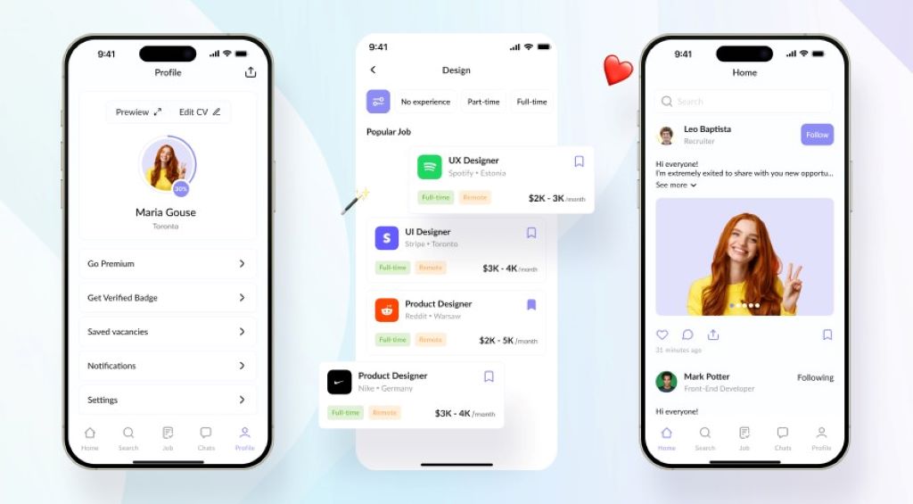
Step 2: Simplify Navigation—The Golden Rule of User-Friendly Design
Navigation is the backbone of your app. If users can’t find what they need, they’ll leave. Here’s how to make navigation intuitive:
Stick to Familiar Patterns
Users expect certain behaviors:
- Bottom navigation bars for primary actions (e.g., Home, Search, Profile).
- Hamburger menus for secondary options (though use sparingly—they hide content).
- Swipe gestures for actions like deleting or liking.
Limit Choices
Too many options overwhelm users. Follow Hick’s Law: The more choices you present, the longer it takes to decide. Aim for no more than 5 main menu items.
Use Clear Labels and Icons
- Labels: Use simple, action-oriented words like “Book Now” or “Save for Later.”
- Icons: Pair icons with text for clarity. A heart icon might mean “favorite” or “like”—make it obvious.
Pro Tip: Test your navigation with first-time users. If they can’t find a feature within 10 seconds, redesign it.
Step 3: Prioritize Speed and Performance—The Silent Killer of User Retention
Slow apps frustrate users. 40% of users will switch to a competitor’s app if yours is sluggish. Here’s how to optimize performance:
Optimize Images and Media
- Compress images without losing quality.
- Use lazy loading to load content as users scroll.
- Avoid auto-playing videos—they drain data and annoy users.
Reduce App Size
- Minimize third-party libraries that bloat your app.
- Use vector graphics instead of high-res images where possible.
Test on Real Devices
Emulators aren’t enough. Test on low-end and high-end devices to ensure smooth performance for all users.
Pro Tip: Aim for a load time under 2 seconds. Use tools like Google’s Lighthouse to audit performance.
Step 4: Design for Thumbs—The Ergonomics of Mobile Interaction
Mobile users interact with apps using their thumbs. 49% of users hold their phones one-handed, so your design must accommodate this:
Place Key Actions Within Thumb’s Reach
- Bottom corners are easiest to tap.
- Top corners are hardest—avoid placing critical buttons there.
Use Adequate Touch Targets
- Buttons should be at least 48×48 pixels to prevent mis-taps.
- Space interactive elements 10–15 pixels apart to avoid accidental clicks.
Avoid Clutter
- White space improves readability and reduces cognitive load.
- Group related actions to minimize thumb movement.
Pro Tip: Use heatmaps to see where users tap most. Adjust your layout accordingly.
Step 5: Make It Accessible—Design for Everyone
Accessibility isn’t optional—it’s a legal requirement in many regions and a moral obligation. 1 in 5 people have a disability that affects how they use mobile apps. Here’s how to design inclusively:
Support Screen Readers
- Use semantic HTML and ARIA labels for dynamic content.
- Provide alt text for images and captions for videos.
Choose Accessible Colors
- Ensure sufficient contrast between text and backgrounds (aim for a 4.5:1 ratio).
- Avoid relying solely on color to convey information (e.g., red for errors).
Offer Customizable Text Sizes
- Allow users to adjust font sizes without breaking your layout.
- Use relative units (em, rem) instead of fixed pixels for text.
Pro Tip: Test your app with screen readers like VoiceOver or TalkBack. Experience it as a visually impaired user would.
Step 6: Personalize the Experience—Make Users Feel Seen
Users crave personalization. 80% of consumers are more likely to use an app that offers tailored experiences. Here’s how to implement it:
Use Data Wisely
- Location-based offers: “Welcome back to London! Here’s a local deal.”
- Behavioral triggers: “You left items in your cart—complete your purchase now!”
Allow Customization
- Let users choose themes (dark/light mode).
- Enable favorite features or shortcuts for frequent actions.
Implement Onboarding
- Guided tours for first-time users.
- Tooltip hints to explain features without overwhelming users.
Pro Tip: Use A/B testing to refine personalization. What works for one user segment may not for another.
Step 7: Test Relentlessly—The Key to Flawless User-Friendly Design
Testing isn’t a one-time task—it’s an ongoing process. Here’s how to do it right:
Usability Testing
- Moderated tests: Watch users interact with your app in real time.
- Unmoderated tests: Use tools like UserTesting or Maze for remote feedback.
Beta Testing
- Release a beta version to a small group of real users.
- Collect feedback on bugs, confusion points, and feature requests.
Analytics and Heatmaps
- Track user flows, drop-off points, and session lengths.
- Use heatmaps to see where users tap, swipe, or ignore.
Pro Tip: Fix critical issues first, then iterate on smaller improvements.
Reviews: Real-World Examples of User-Friendly Mobile App Design
Case Study 1: Duolingo—Gamification Done Right
Duolingo’s app uses bite-sized lessons, progress bars, and rewards to keep users engaged. Their onboarding is seamless, and the UI is clutter-free. Result: Over 500 million downloads and a 45% user retention rate.
Case Study 2: Monzo—Banking Simplified
Monzo’s app focuses on clarity and speed. Features like instant transaction notifications and budgeting tools are easy to find. Their thumb-friendly design makes banking effortless. Result: 7 million users and a 4.8-star rating on app stores.
Related Job:
-
Powerful UX Design Strategies to Boost Your Startup Website Conversions in 2025
-
Powerful UX Design Strategies to Boost Your Startup Website Conversions in 2025
7 FAQs About Designing User-Friendly Mobile Apps
1. How do I choose between iOS and Android design guidelines?
Start with platform-specific guidelines (Apple’s Human Interface Guidelines and Google’s Material Design). If budget allows, design for both but prioritize your audience’s preferred platform.
2. What’s the ideal number of screens in an onboarding flow?
Keep it under 4 screens. Each screen should explain one key benefit or action.
3. How can I reduce app abandonment?
Focus on fast load times, clear value propositions, and minimal friction. Offer a quick demo or tutorial for complex features.
4. Should I use animations in my app?
Yes, but sparingly. Animations should enhance usability, not distract. For example, use a loading spinner or smooth transitions between screens.
5. How do I handle user errors gracefully?
Use clear, constructive error messages. Instead of “Error 404,” say “Oops! We couldn’t find that page. Try refreshing.” Offer solutions, not just problems.
6. What’s the best way to gather user feedback?
Combine in-app surveys, app store reviews, and usability tests. Tools like Instabug or Apptentive make feedback collection easy.
7. How often should I update my app’s design?
Monitor user behavior and feedback continuously. Plan major redesigns every 12–18 months and minor updates quarterly.
Conclusion: Your Blueprint for User-Friendly Mobile App Success
Designing a user-friendly mobile app isn’t about luck—it’s about empathy, testing, and relentless optimization. The best apps anticipate user needs, eliminate friction, and deliver value instantly.
Your action plan:
- Research your users to understand their needs and pain points.
- Simplify navigation with familiar patterns and clear labels.
- Optimize performance for speed and responsiveness.
- Design for thumbs and accessibility to reach everyone.
- Personalize the experience to make users feel valued.
- Test continuously and iterate based on real feedback.
The mobile app market is crowded, but great design cuts through the noise. Start applying these principles today, and watch your app become a user favorite.
Ready to design an app users will love? Start with user research—and build something extraordinary.
