Facebook continues its commitment to modify the Messenger interface every few weeks. We have already seen everything : advertising, games, stickers, instant articles … Now it is the turn to the tabs at the top, a test that are receiving some users and, if it was satisfactory, would end up applying to everyone in a future.
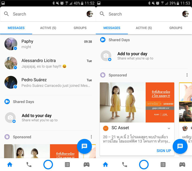
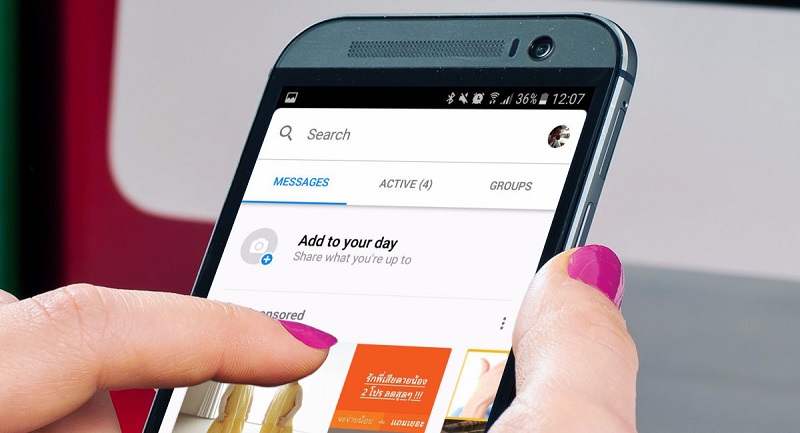
Do you think the Facebook Messenger interface is a mess and that the application is becoming little less than a monster? Well wait, there’s still more. Facebook is trying to separate the interface with three tabs: Messages, Assets and Groups.
Messages, for messages and … thousand more things

Bearing in mind that the first tab is called “Messages”, you would expect it to be a clean list of all your recent conversations, and you would be wrong. The content of this tab is the same as before, mixing several disconnected sections such as recent messages, Messenger Days and advertising.
Active, for your connected contacts

The Active tab now shows the contacts that are currently online in Facebook Messenger and, therefore, should respond more quickly (in theory). This group appeared before as a tab in the main tab, now “messages”. It is necessary to mention that here are mixed contacts that you have in Facebook with those who do not but with whom you have spoken in Messenger.
You may also like to read another article on FreshLookApp: Facebook Stories: What are and how Facebook ephemeral stories work?
Groups, for group chats

Finally, you could not miss the group tab. In this case, it shows exactly the same thing you used to display when you clicked on the group icon, but it was in the bottom part of the window like a button, instead of being a tab on the back.
Another test more

This change was probably caused by trying to find the icon of the command to activate games in Messenger. The gap has been found, yes, but the redesign of the interface elements still does not have the slightest sense. Some elements are up, others are down, and others are simply repeated. More luck in the next iteration.

